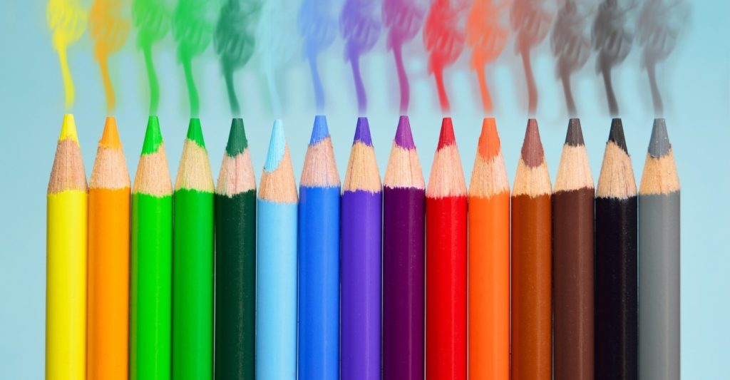
If you want to connect with your target audience, you need to know them first. You also need to connect with your audience in a way that touches their emotions and beliefs and preferences. And whilst there are many things you can do to connect with your audience, one of the first steps is to pay attention to your product labels. Your product label is your calling card; often, it’s the first introduction of your brand to your target audience. There are many aspects to creating the perfect product label, including material, size, images, and fonts, but there is one aspect which can make a vast impact as well: colour. Here’s how you can optimise the psychology of colours to create the best product label.
What you need to know
You need to understand how important colour really is in your product label. For instance, did you know that 85% of today’s consumers relate to and identify with colour when it comes to their decision to purchase a product? What’s more, 60% of the first impression of your product will often be based on the colours of its label. It also takes consumers only about 90 seconds to make a judgment about your product on a subconscious level. So, what does all this mean? Simple: it means that you have to choose your colours wisely; set a mood or vibe which your consumers can relate to and appreciate.
A look at the moods and emotions invoked by colours
Many different colours invoke different moods and emotions, as confirmed by specialists in labelling machinery like Atwell. It’s important for you to know and understand how various colours can affect your consumers’ moods. Let’s take a look at some colours and how they are perceived by consumers:
- Pink – pink is perceived as calming and relaxing, and one interesting fact about it is that pastries are believed to actually taste better when they are on pink plates or in pink boxes. Think of some brands which accentuate pink, such as Barbie and LG.
- Red – red symbolises passion and boldness, and it has been said that when we see the colour red, our metabolism increases, and our appetite is then stimulated. Think brands such as McDonald’s, for instance, or Coca-Cola.
- Orange – this colour is seen as fun, and this may be one major reason why children are drawn to it. But in the advertising sector, orange plays another role as well – a small and subtle amount of orange in a label can also be perceived as affordability.
- Green – green is associated with growth and nature, and in the world of advertising, it can be connected to the environment as well.
- Yellow – the colour yellow is seen as optimism and joy, and it is the colour which is the most visible in the entire spectrum of colours. Yellow is often utilised in display windows, so customers are drawn in. One example of a brand which has made use of yellow is Nikon.
- Blue – the colour blue signifies security and confidence, and this may be why brands such as HP and Visa make full use of it. In the advertising arena, blue also stands for productivity.
- Brown – brown is often seen as comforting and reliable, as evidenced by brands such as UPS and M&M’s. Brown is also utilised in advertising as an effective background colour.
There are definitely many colours from which you can choose for your product label, but you have to know what your audience wants to see and what can attract them. When you have the right colours, your product can go far indeed.
